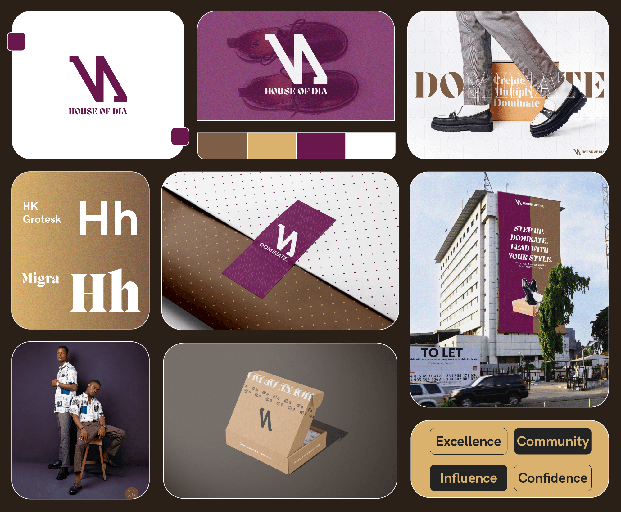
House of DIA

Brand Identity - Design Luxury redefined for men who lead with presence.

Role

Lead Brand Designer

Industry

Fashion

a cell phone on a bench

Overview

House of DIA is a premium fashion brand rooted in purpose, driven by style, and designed for men who are ready to dominate in their sphere. The brand offers high-quality corporate footwear and styled shirts with a vision to influence culture through bold creativity and elegant craftsmanship.

The challenge was to craft a distinctive, minimal identity that visually communicated strength, style, and forward motion, aligning fully with the brand's mission to reign and lead in the fashion space.

My Role

I served as Lead Brand Designer, managing the entire identity system from logo development and typography to packaging and digital presence.

Creative Direction

The core identity had to embody what the brand stands for: dominion, consistency, and visionary leadership. The goal was to keep the design clean and modern while infusing it with subtle symbolism that deepens meaning over time.

a cell phone on a bench
a cell phone on a ledge

Process

The logo redesign was a thoughtful evolution not just a surface change, but a strategic transformation. Built around the initials “DIA,” the wordmark was refined to incorporate deeper visual cues:

  • Flow, Progress, Cycle Representing the brand’s core values: consistency, movement, and growth.

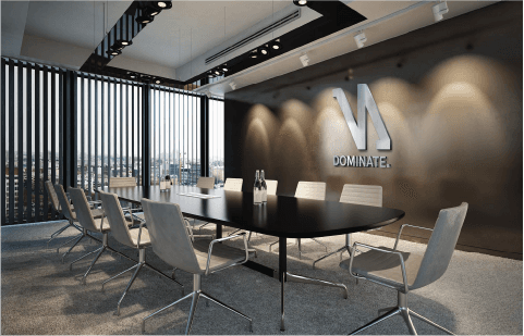
  • Eagle-Inspired Form Drawing from the eagle as a symbol of power, clarity, and vision, the logo captures House of DIA’s high-altitude aspiration in the corporate fashion space.

The clean, minimal structure balances modernity with a regal confidence positioning the brand to lead in both digital and physical touchpoints.

Deliverables

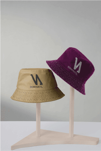
  • Custom logo and alternate lockups

  • Typeface and color direction

  • Visual style guide

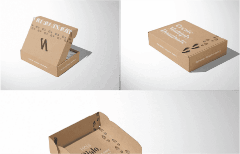
  • Packaging and label design

  • Social and brand presentation templates

a cell phone leaning on a ledge
a black cellphone with a white letter on it
a cell phone on a table

Outcome

The rebrand elevated House of DIA’s visual identity from start-up to standout aligning with its ambition to become a dominant force in men's luxury fashion. The result is a logo that doesn’t just look the part, it feels like the brand: powerful, precise, and in motion

Outcome

The rebrand elevated House of DIA’s visual identity from start-up to standout aligning with its ambition to become a dominant force in men's luxury fashion. The result is a logo that doesn’t just look the part, it feels like the brand: powerful, precise, and in motion

Other projects

Copyright 2025 by Subair Samuel

2025 Imole. All Rights Reserved

Copyright 2025 by Subair Samuel

Create a free website with Framer, the website builder loved by startups, designers and agencies.